There should be a warning to these bad website design: May cause headaches, eye strain, and sudden urges to close the tab. The disintegration of form, function, and logic when left unchecked, chaos reminds one of what the design calamity is.
Such sites prove that in a world where user experience defines brand perception, it’s not just a simple mistake but a business liability-a poorly designed website. They confuse visitors when navigating and have flashy colors like neon street signs; they have earned their place in the digital hall of shame.
This comprehensive blog walks through bad website design examples, including some surprisingly popular bad design sites, to help understand how good web page design compares with bad web design and why some sites unintentionally masterclass what not to do.
What Are the Features of a Bad Website Design?
It is highly important to understand the key factors of a poorly designed website before going through the example. Below are some of the most common features of a bad website design:
- Complicated Navigation: Users shouldn’t have to spend hours on a treasure hunt finding information.
- Visual Clutter: People get overwhelmed with tons of words, images, and pop-ups.
- Sluggish Loading Speed: Badly optimized assets create days of waiting.
- Non-Friendly Design: Not good on phones; indeed, a majority of the audience is lost.
- Inconsistent Fonts and Colours: Bad typography, plus contrasting colours done by users, lead to confusing things.
- Technical Defaults: Broken links and 404 errors compromise credibility.
- Old-fashioned Design: Old-fashioned and untrustworthy layouts look unprofessional.
Top 20 Bad Website Design Examples With & Analysis
Yale School of Art
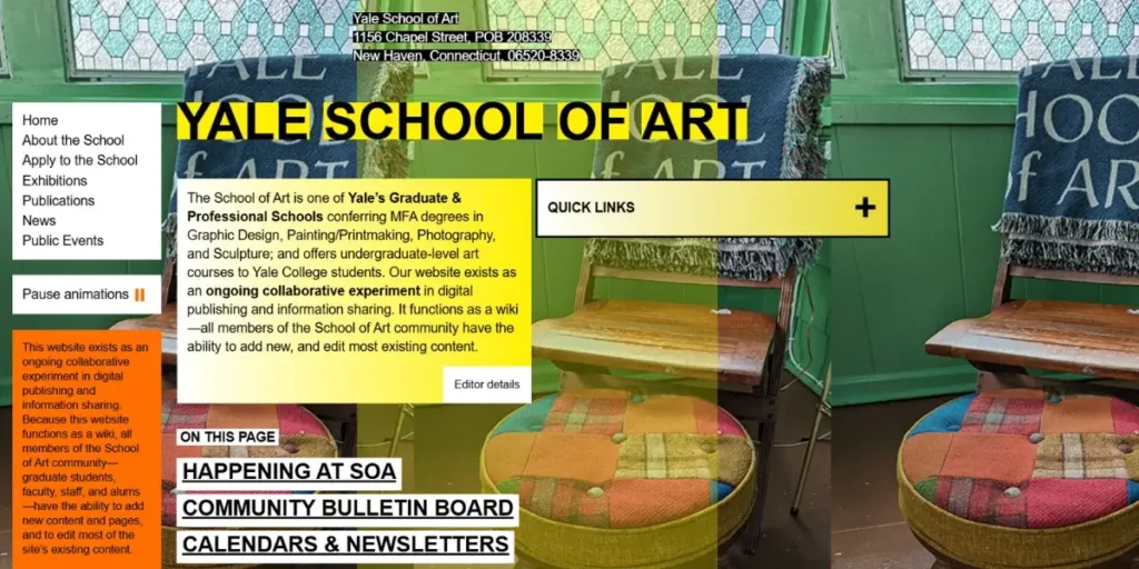
The layout of this site is so congested with overlapping components that it has menus that aren’t arranged well and shows strange forms of font styles. Possibly, pictures of such an art school would only signify better aesthetics, which at its least makes the whole thing hard for the visitors to understand when they are looking for the key information on the site.
Arngren.net
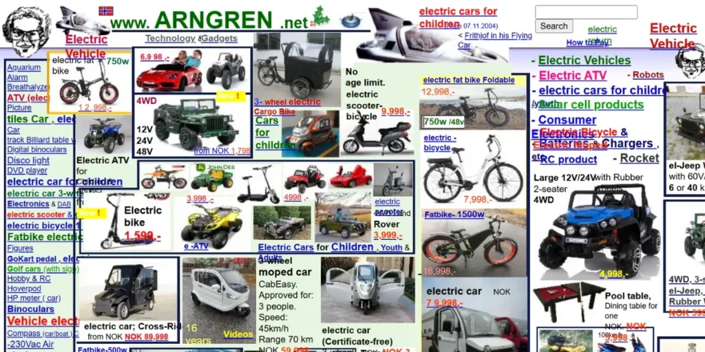
The overload of links, images, and advertisements all fit on one page, making Arngren.net truly overwhelming. It lacks any sort of structure or visual hierarchy, making the entire browsing experience one confusing ordeal.
LingsCars

In vivid flashes and ostentatious colours, waving animations blare into the ears, denying any chance of concentration. Essentially, the whole design of the website actually darkens its major point of consideration, which is car leasing, making it important to keep content-focused.
Pacific Northwest X-Ray Inc.

This site is so dated that it seems to have been left over from the 1990s, with images that are not only small but also hard to read. Its long and winding sentences make it hard for users to find pertinent information.
Suzanne Collins Official Website

This was the official site of a great author; otherwise, it is outdated and low in visual aesthetics, with really big issues with mobile compatibility. Navigation is not so intuitive, which is also why the user experience suffers.
Irish Walled Towns Network

A lot of white space without the good placement of content renders the pages incomplete. Hence, it does not technically convey the pictorial direction of its true purpose at first glance.
Gates N Fences
Etched in Most of the outmoded designs, scrolling text cannot produce low-quality graphics from this site to earn an image of professionalism. Such an aspect was elaborated in its jumbled homepage with complicated navigation.
Penny Juice
Hitting neon backgrounds and colors on typography that doesn’t match would make this site almost illegible and too visually overwhelming. Even the branding and navigation structure leave one with little to cohere or comprehend when visiting this site.
Jamilin
Again, the disorganized layouts and moving backgrounds make use of a lot of color gradients. Even the visitor would be greeted with chaotic visuals, which would be too distracting from real content.
Apollonia Dental
Despite being in the health sector, this site looks quite outdated in design, and it has some broken navigation links. The layout is disjointed, leading to a very frustrating user experience when trying to find dental services.
Mojang (Old Minecraft Site – Archived)
The old Minecraft site, indeed, was cramped with huge blocks of text and completely not visual. It was fairly difficult for anyone who was new to the place to find his or her way around. There wasn’t really the “modern, engaging interface” that was promised to the gaming community.
Craigslist
Craigslist might be known by a lot of people on how functional it is, but in fact, it displays some minimalistic, bare, and text-heavy layouts without thorough design contemplation. For first-time visitors, such a setup can be somewhat puzzling and not very clear.
Berkshire Hathaway
This site is its highly minimalist corporate site; stripped down to the barest necessities, putting in simple text links onto a completely barren background. There are no visible images, navigation as modern as it is, or any interactive features; it sounds more like an early web directory than a portal for a Fortune 500 company.
Pacific Coast Feather Company
Stale product displays from years gone by with no engaging visuals make for an underwhelming e-commerce experience. Even an uninspiring design hardly builds trust in potential shoppers.
The World’s Worst Website Ever
Of course, this is a satirical site with every bad design tactic imaginable: flashing text, clashing colours, and scrolling banners that go on forever. It is a prime example that every web designer ought to see.
Exmouth Online
Outdated design aesthetics, broken links, and nonsensical page layouts result in an experience without new functionality and less advice to users.
The Gates of Hell
Harsh, jarring colours and extreme background contrasts in this site make it hard to read. Poorly structured and clustered navigation brings it to an end in an annoying user experience.
Penny Arcade (Old Version – Archived)
Densely packed with links, ads, and even more areas of heavy content, the old Penny Arcade might have had cluttered navigation, especially for first-time users.
BonBon Balloons
The site might have a stunning visual appeal, but complex navigation and unclear call-to-action buttons make the whole purchasing process difficult. It’s a design that favours style over usability.
Yvette’s Bridal Formal
Renowned for having one of the worst designs out there, it contains garish backgrounds, scrolling text that goes on and on, autoplay music, and misplaced clutter. The overall feeling one gets is one of chaos and disorganization.
Popular Websites With Bad Design: Why Do They Still Survive?
Some of the popular ones are:
- Reddit: Reddit is a text-heavy, cluttered interface, but has very active communities.
- Craigslist: An old and out-of-date design, yet its main classifieds rental continues because it was simply useful.
- Berkshire Hathaway: A veritable no-frills-and-squares approach through which the company relies on brand legacy more than modern UX.
- Lesson: All these sites survive due to their very niche values, which the mainstream businesses today cannot afford to ignore: usability and modern design principles.
Good Web Page Design vs Bad Website Design: A Detailed Comparison
| Element | Good Web Page Design | Bad Website Design |
| Navigation | Clear, easy-to-use menus and paths | Hidden or overwhelming menus, confusing structure |
| Visual Appeal | Professional, clean design with thoughtful visuals | Clashing colours, poor layouts, and excessive animations |
| Loading Speed | Fast, optimized for all devices | Slow, lagging due to uncompressed assets |
| Mobile Responsiveness | Fully functional on all devices | Fails to adapt to different screen sizes |
| User Engagement | Balanced use of media and interactions | Intrusive pop-ups, irrelevant ads, distracting elements |
| Accessibility | Meets accessibility standards (WCAG) | Hard-to-read text, inaccessible for users with disabilities |
How to Avoid Bad Website Design Mistakes?
- Simplified Navigation: Designed for intuitive menus and site structure for users.
- Speed Optimization: Ensure images are compressed, scripts are reduced, and caching is enabled for fast loading.
- Mobile-Friendliness: A mobile-first design approach is needed.
- Visual Consistency: Ensure consistency in colour, font, style, and overall layout.
- Auditing: Conduct audits for broken links, outdated content, and inaccessible design.
- Stay Within the Accessibility Law: Design that can also cater to a set of users other than the intended audience; more inclusivity.
Conclusion
Bad design is more than just aesthetics; it amounts to a user trust rating, which may affect search engines’ ranking, and with it, business. The ugly designs illustrate the bad design principles and rejection of them: Poor decision-making designs can considerably reduce the level of engagement of the user.
Businesses need to take into consideration and prioritize some of the principles that define good web design: usability, speed, mobile responsiveness, and accessibility. Keeping away from that will ensure that your website will not be rated among the next top 10 bad website designs. Companies seek to use a design that may prove positive as far as engagement is concerned, from a digital touchpoint for the end users.